


Connecting the rooms with color is applicable in both workspaces and in the home. Color schemes play a major role in the dynamic of the interior design and are known to affect the mood and psychology of people. Today, we at All Painting & Restoration would like to share how you can better connect the rooms with color.
Paint Color Psychology
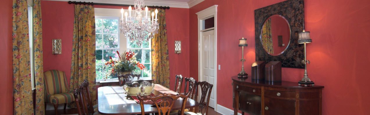
See nothing but white walls glaring back at you is never a welcoming feeling. The wrong colors can seem chaotic or be dreary. Basic understanding of that good old color wheel you used in middle school art class can help in your quest. Generally, restaurants tend to use reds, oranges and yellows to stimulate and tempt diners to rush through their meals and leave to serve the next guest. On the opposite side of the spectrum, blues and greens settle, relax and calm, making them frequently used in spas and therapy offices. The visual impact of color use plays a major role in your house or business.
Monochromatic, Complementary & Analogous Interior Paint Color Schemes
There are three basic color schemes; Monochromatic color, Complementary colors and Analogous colors.
Monochromatic colors. To achieve unity as well as variety, a monochromatic color scheme uses different shades of the same color. For example, 3 different shades of blue such as navy, periwinkle, and pale blue all work well together, and each room can be one of the shades as they all tie together without overwhelming the senses. With each room having their own accent and trim color to unify, it works well in any business or home.
Complementary colors. Complementary colors are referenced to the colors opposite the color from them. For instances purple is the opposite of yellow, orange of blue, and green to red. When used right, the complementary colors can bring balance.
Analogous colors. Thinking of the color wheel, the analogous colors sit next to each other. The space harmonized with unity of these colors and with some creativity, analogous color schemes work very well.
Between making the rooms look fine but not boring, or focused and lively, the accent color is important. A bold accent color is usually more visually striking; however, the color scheme can be completed with 2 colors as well. The accent color can be repeated, but don’t overdo it. The accent is not designed to overwhelm but to compliment the rooms’ layout.
How Lighting Affects Paint Colors
Consider the lighting and what time of lighting. A sunshine yellow will look different in darker rooms, natural light, LED light, fluorescent light, and other lighting. Take the time to pick three favorite colors and paint them on a sample board a couple foot in length and width. Be sure the foundation is white before you paint the 3 shades, if necessary, use 2 coats and hold it along different walls and different times of the day.
Primary Neutral Paint Colors
For a comfortable, yet distinguishable color scheme, start with a neutral and accent with color. Neutrals are more than black and white. Neutrals indicate the hue is a median tone; grays, browns, whites, even some blues, greens, and reds have a muted and conservative. With accents and unifying white woodwork and trim, or even bolder colors, you can make the work or home look amazing.
Interior & Exterior Painting, Trim & More in Show Low, Pinetop-Lakeside, Gilbert, Fountain Hills, Greer, Springville, Eagar, McNary, Alpine, Heber/Overgaard, Payson, Snowflake/Taylor & White Mountains Area of Arizona.
After you got your color scheme, or want professional expertise to help you finalize the colors, call All Painting & Restoration and let our professionals get the project done right.